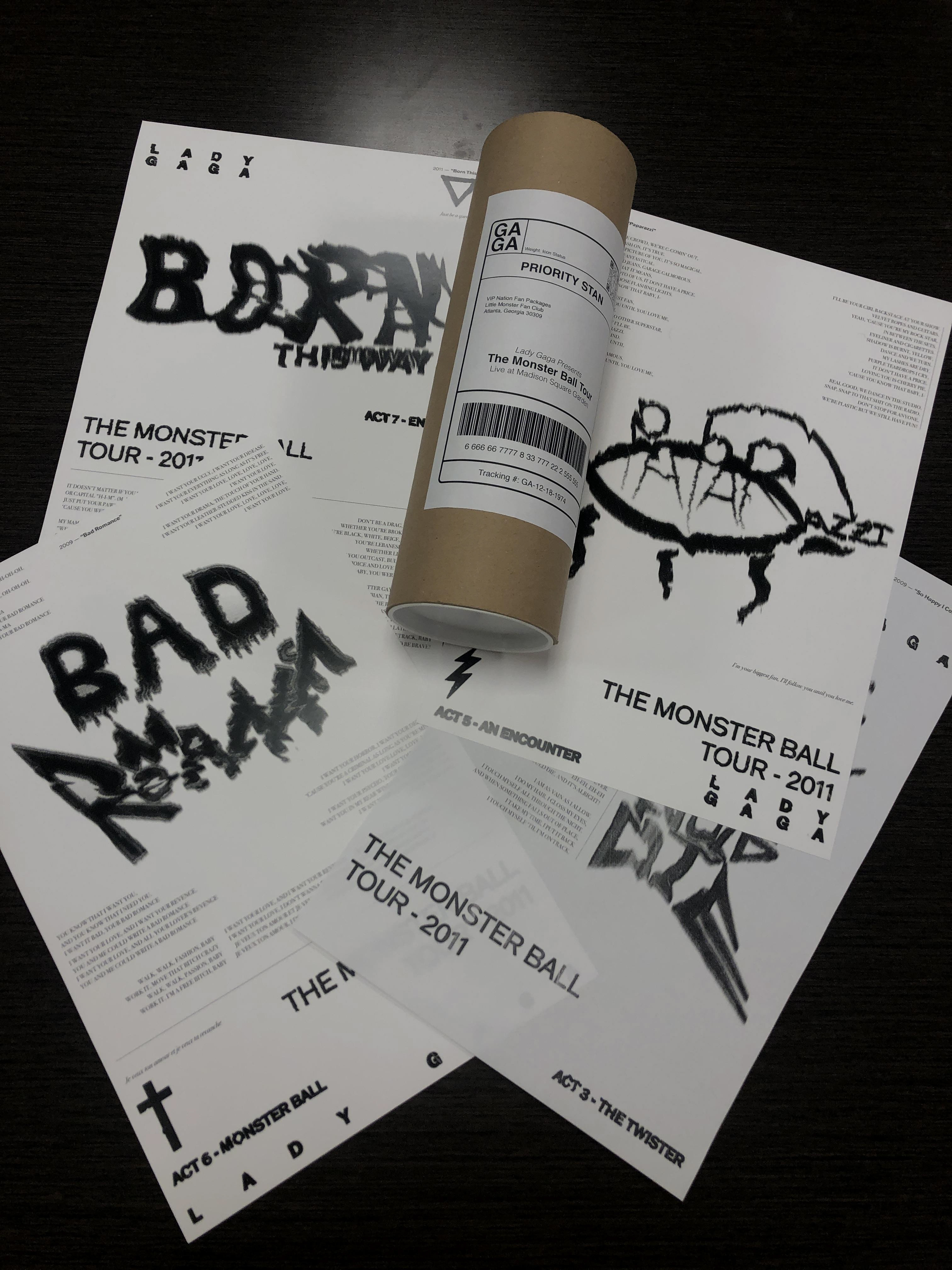
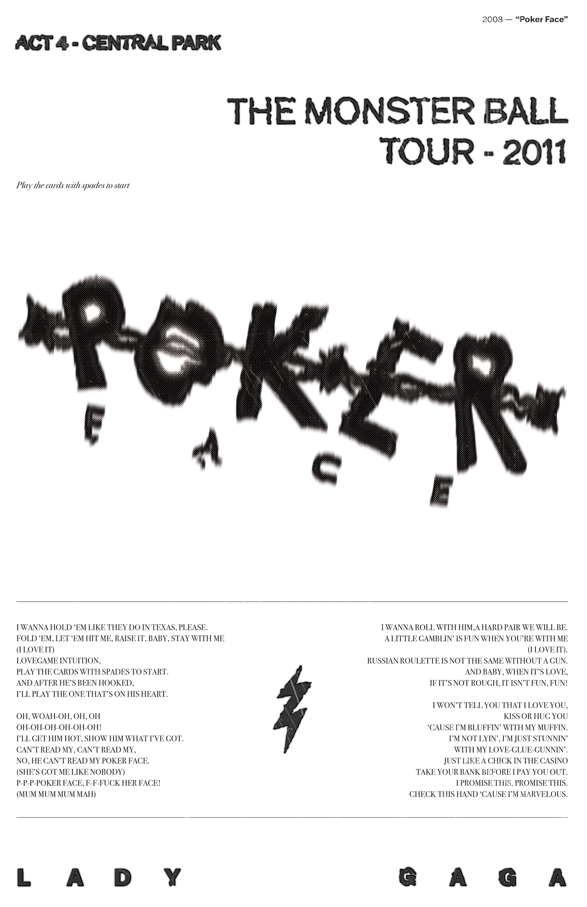
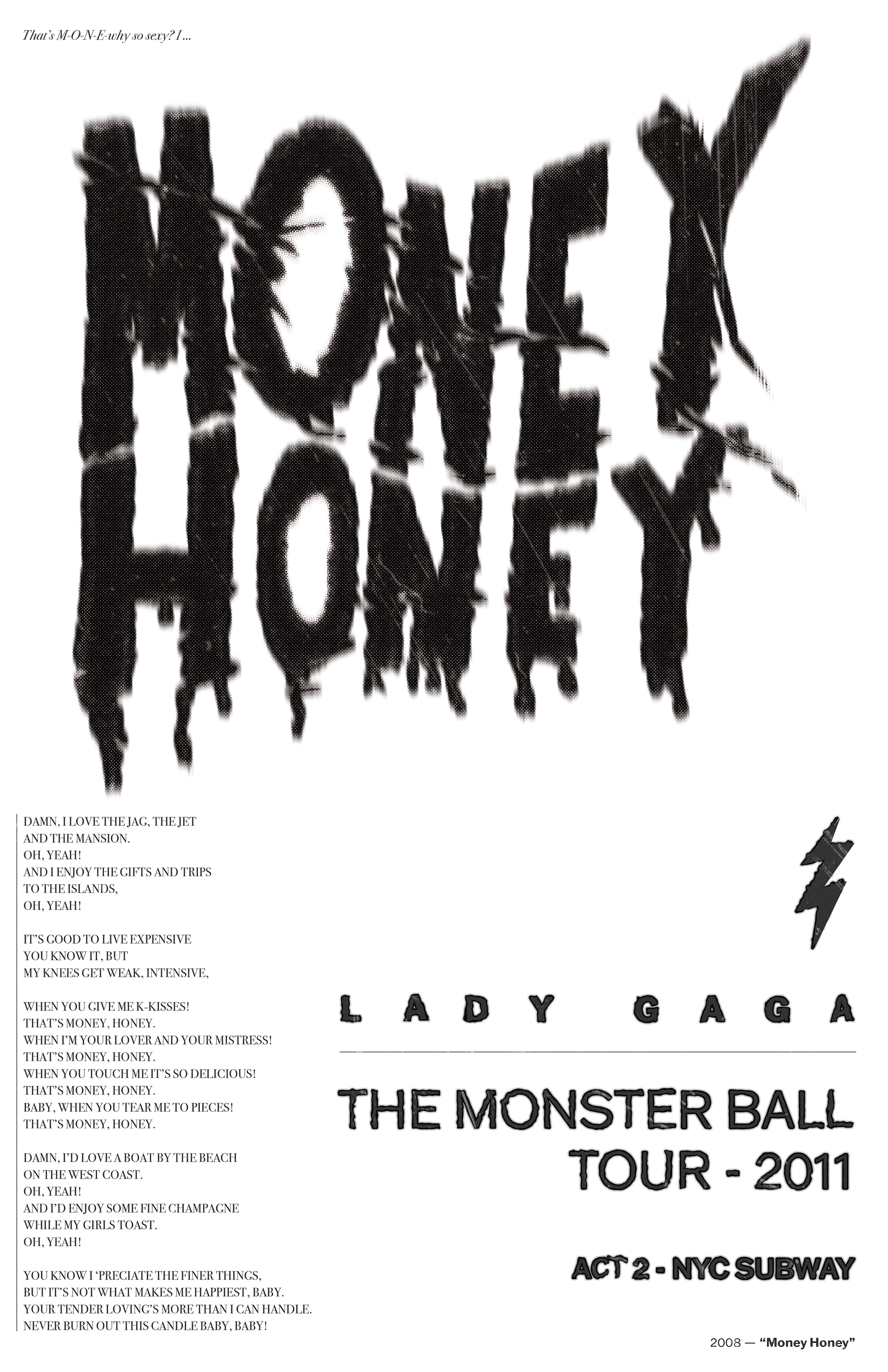
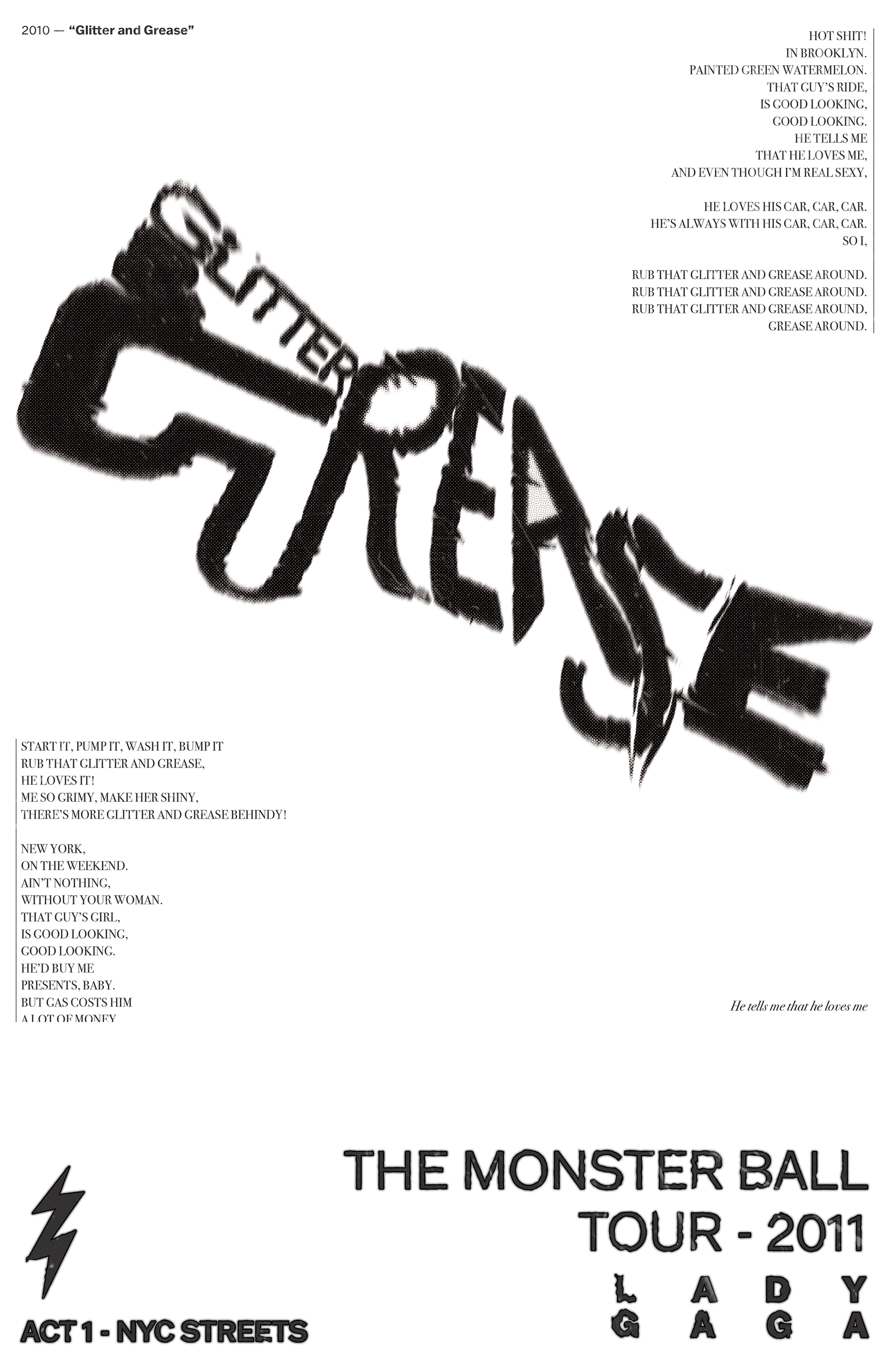
Custom poster package with hand-made & glitched typography

The 2009 - 2011 tour from Lady Gaga, featuring songs from her debut album “The Fame” and extension EP; “The Fame Monster”. Over 200 cities were visited and remains one of the largest female tours of all time. What makes this show unique is the adaptation of a storyline between songs. Filmed over a five day residency in New York City’s Madison Square Garden, and presented by HBO, fans can attend The Monster Ball, any night.
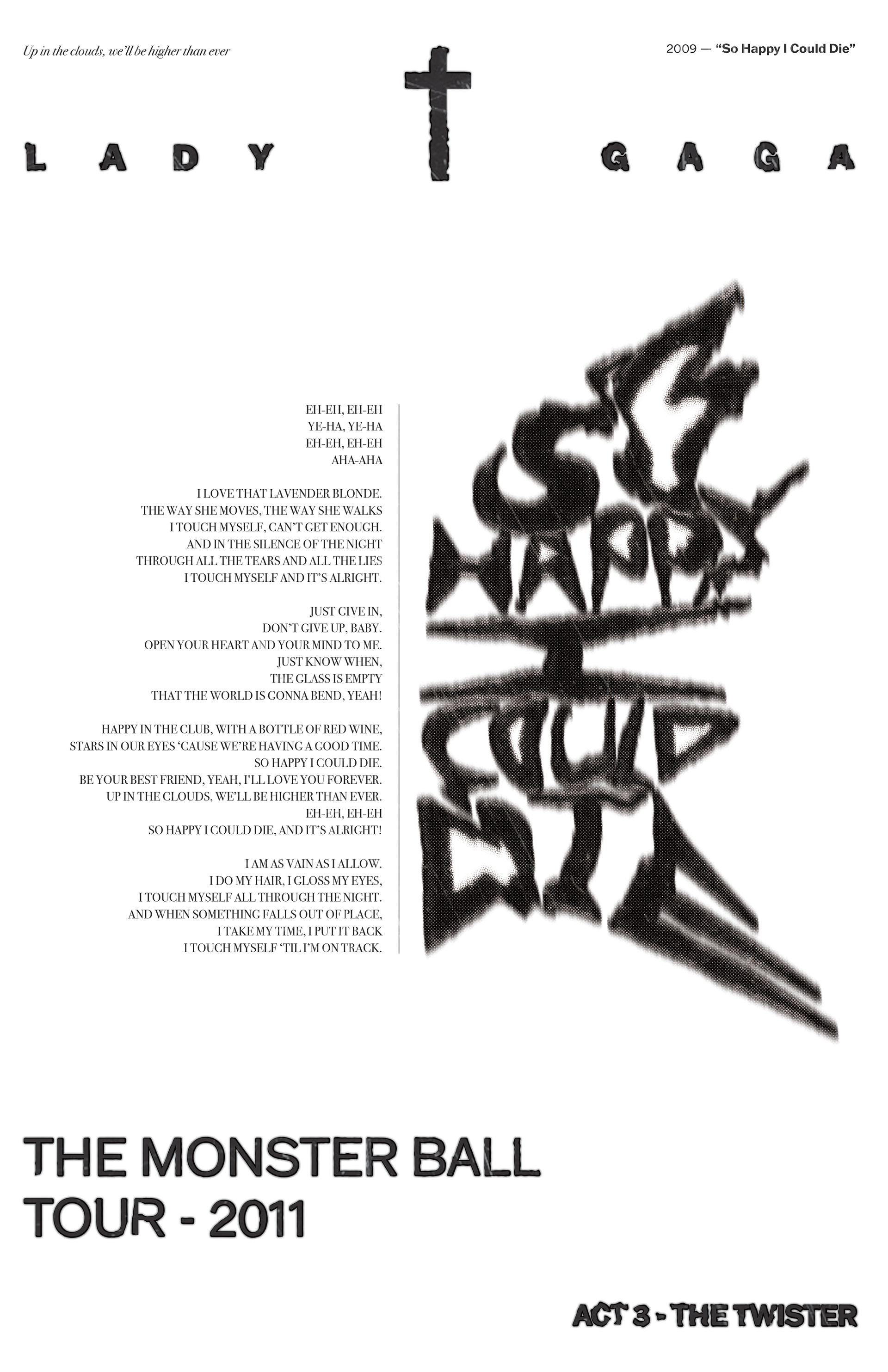
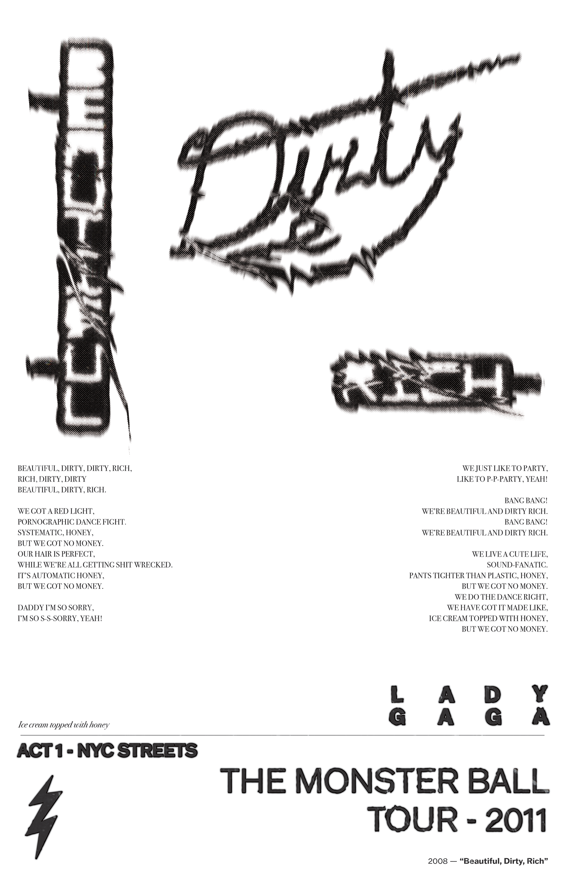
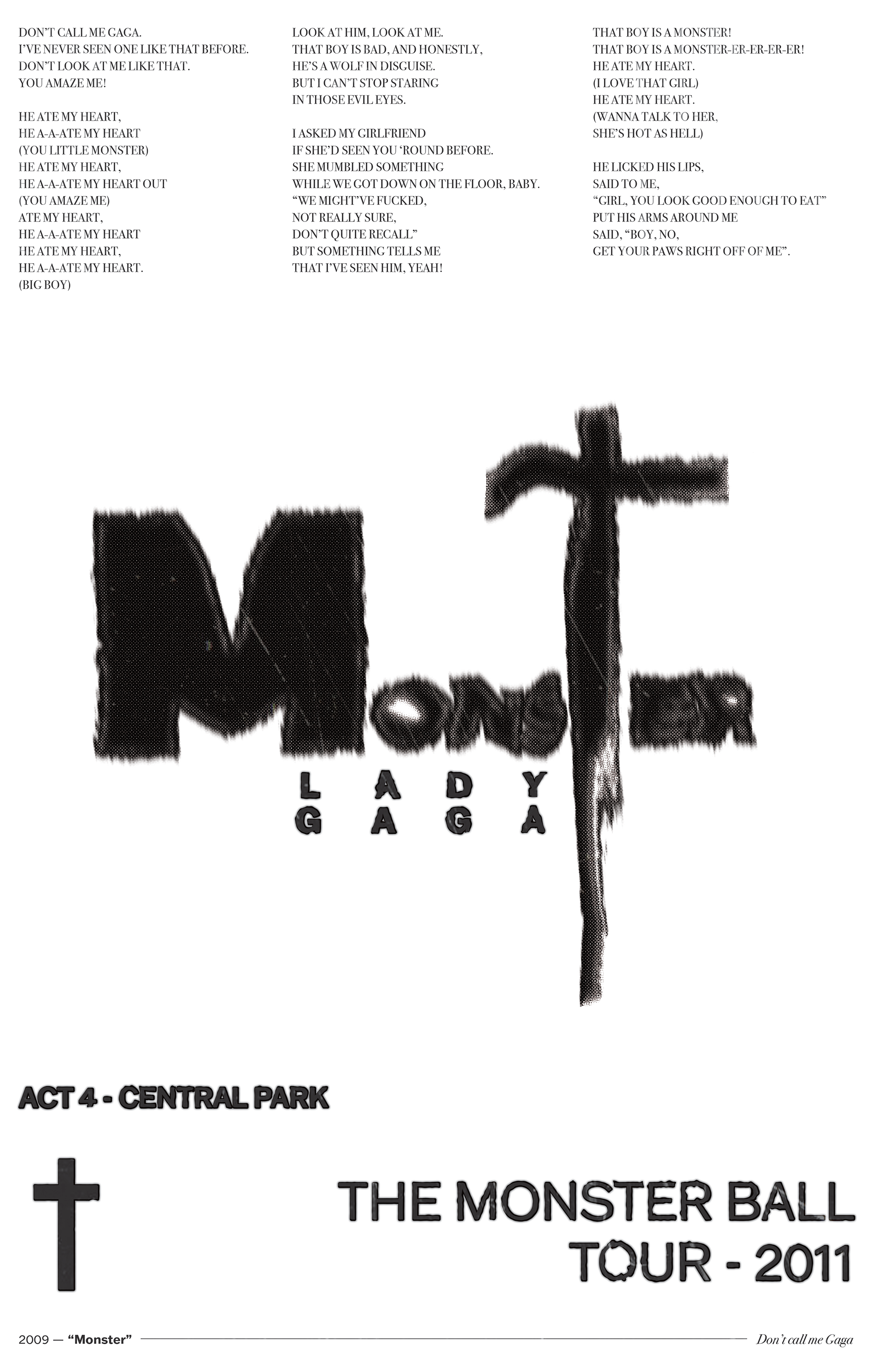
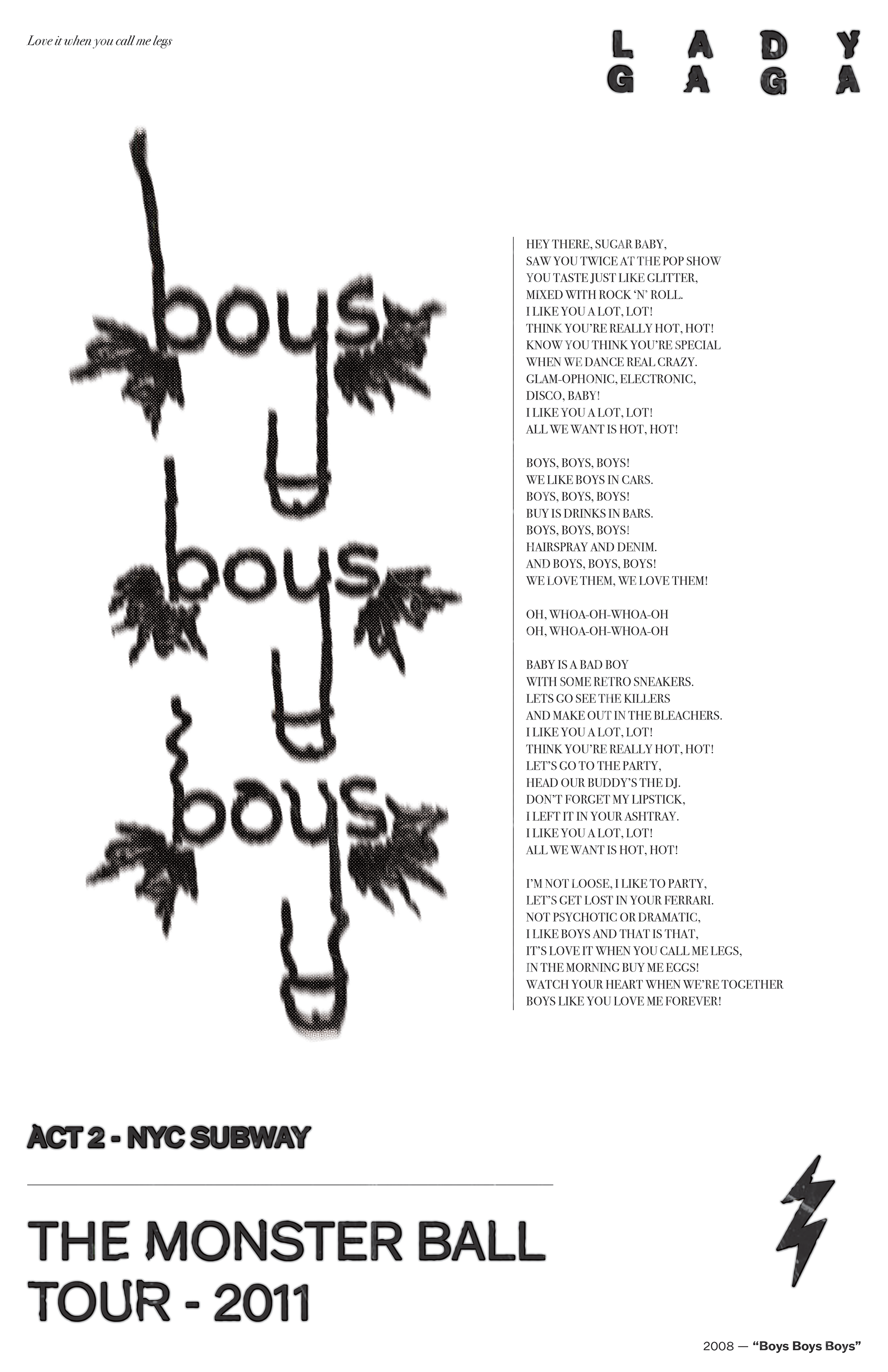
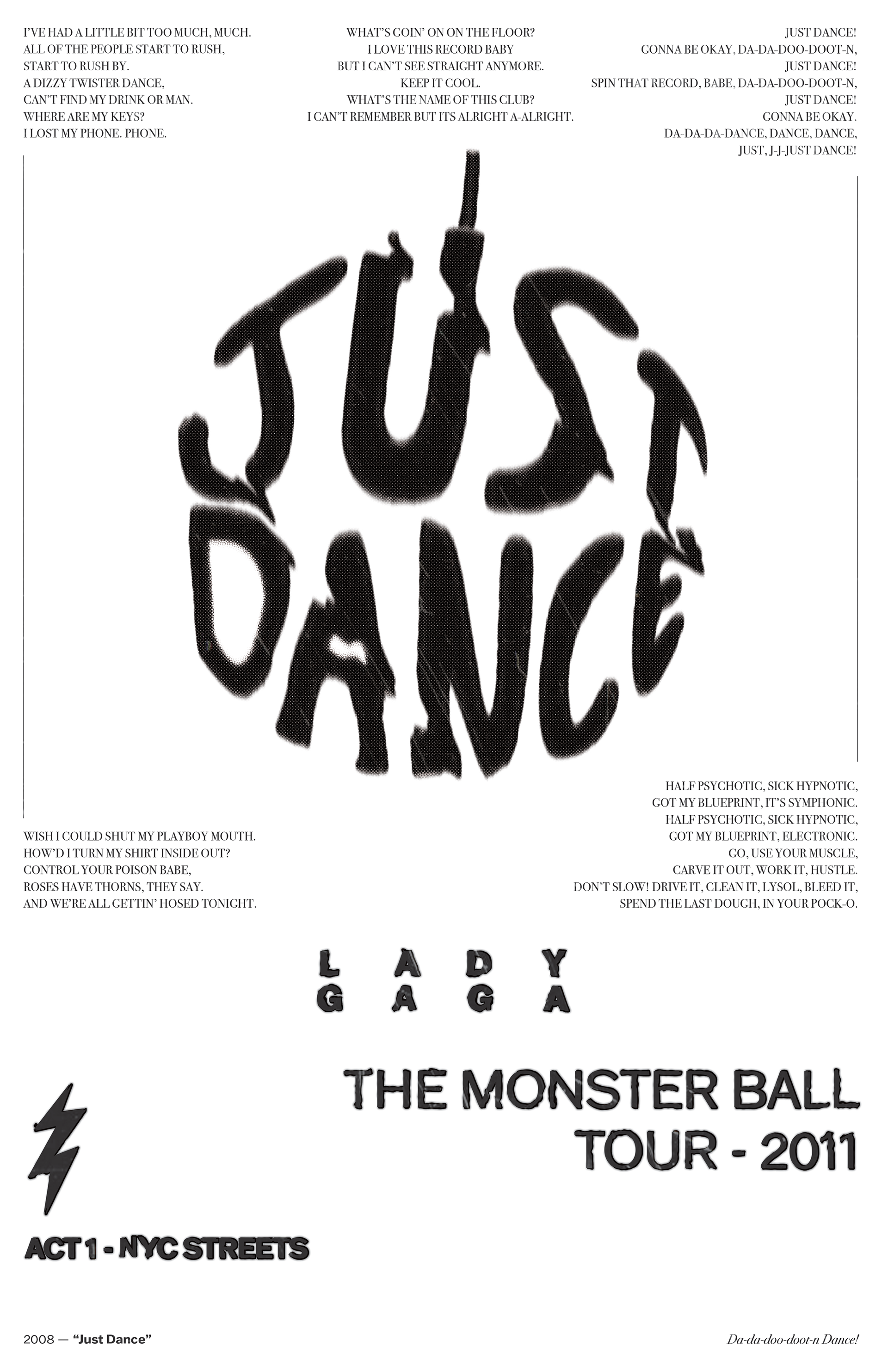
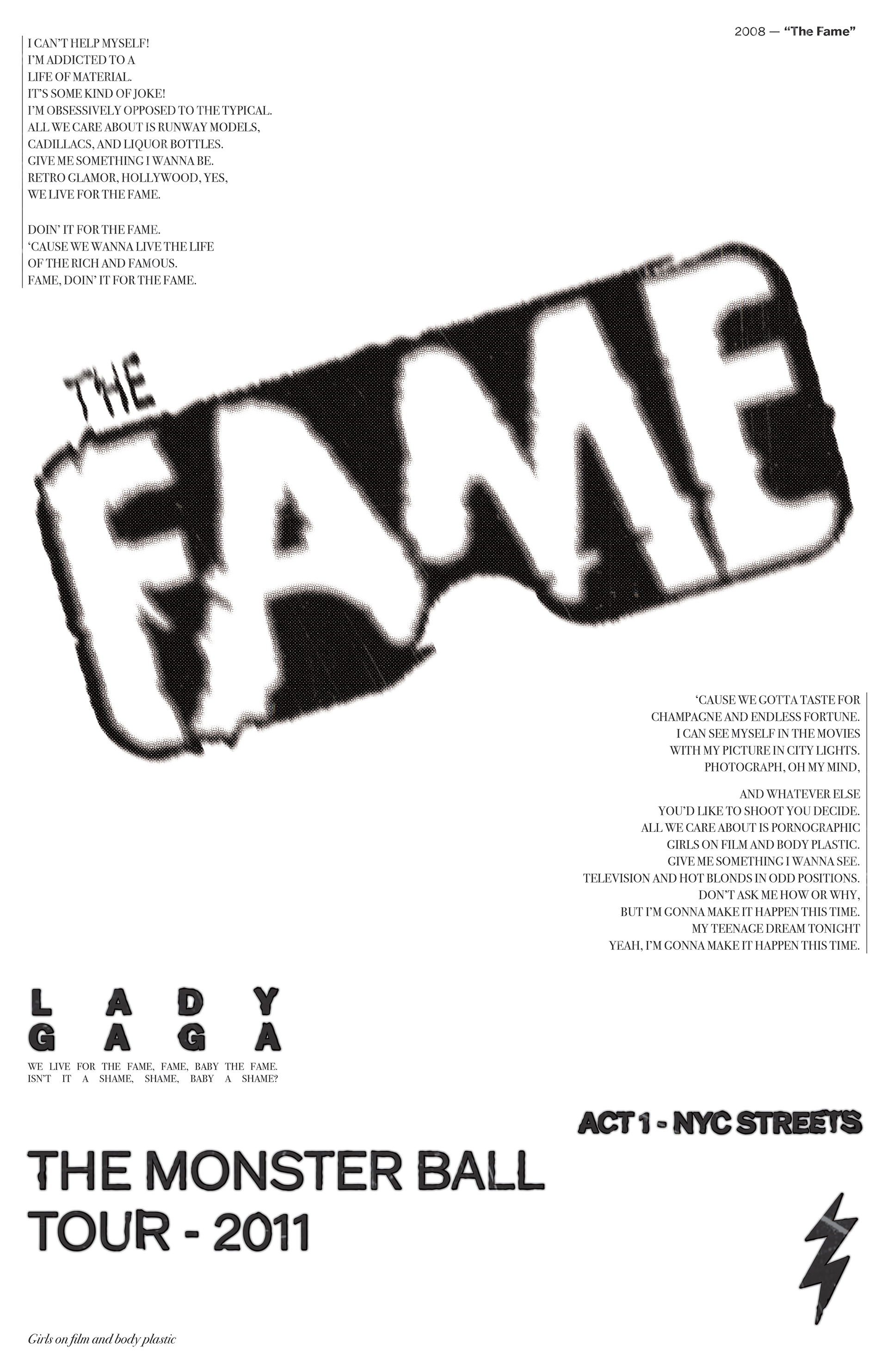
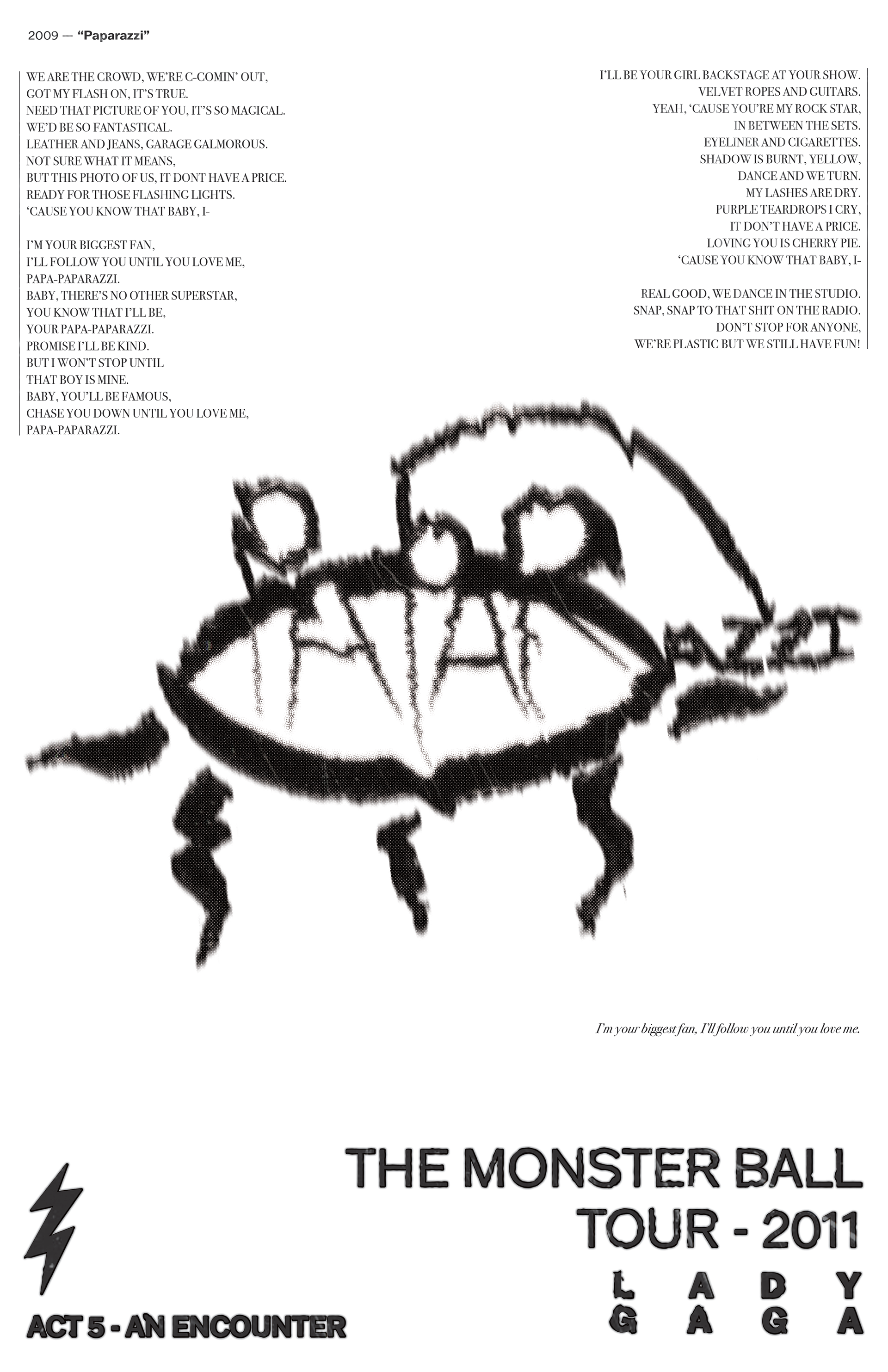
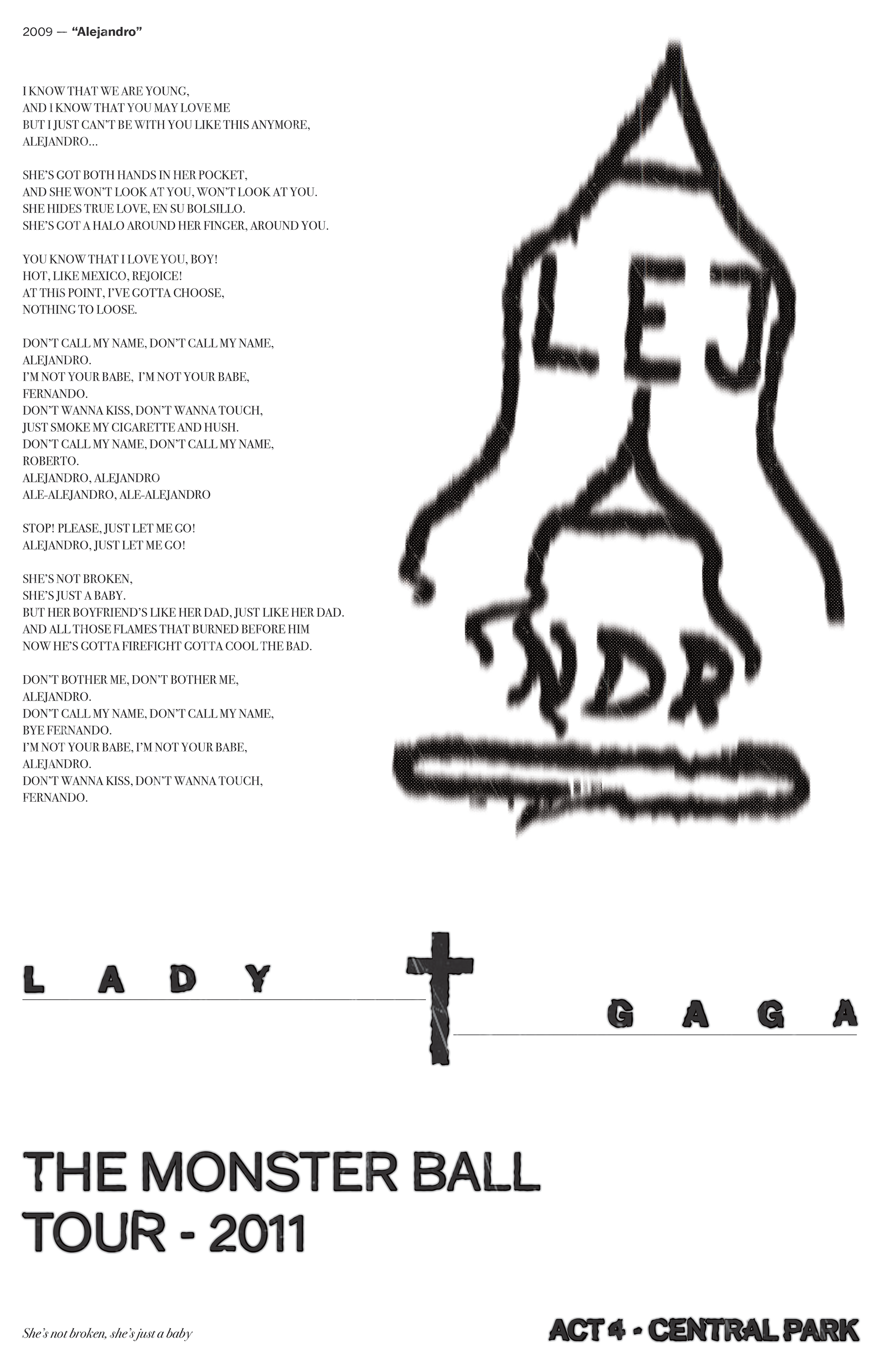
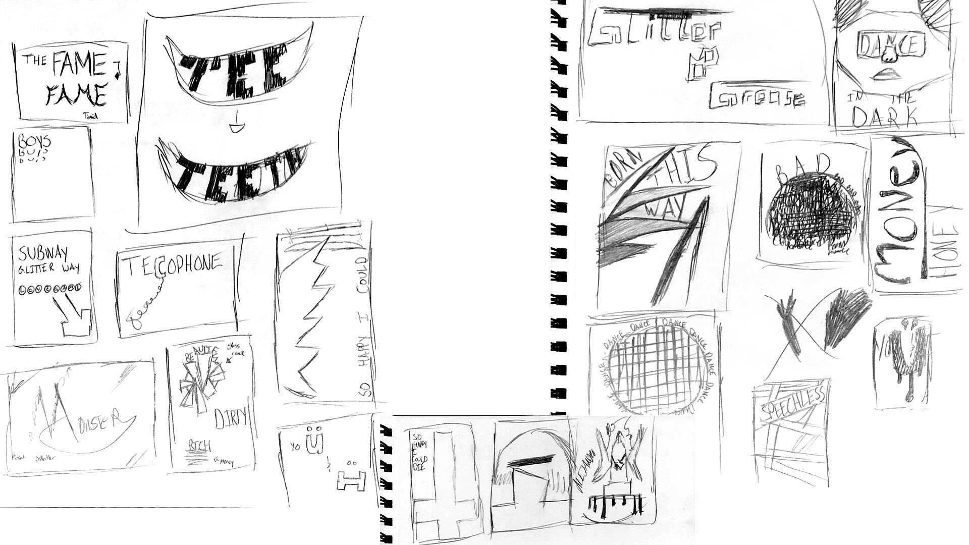
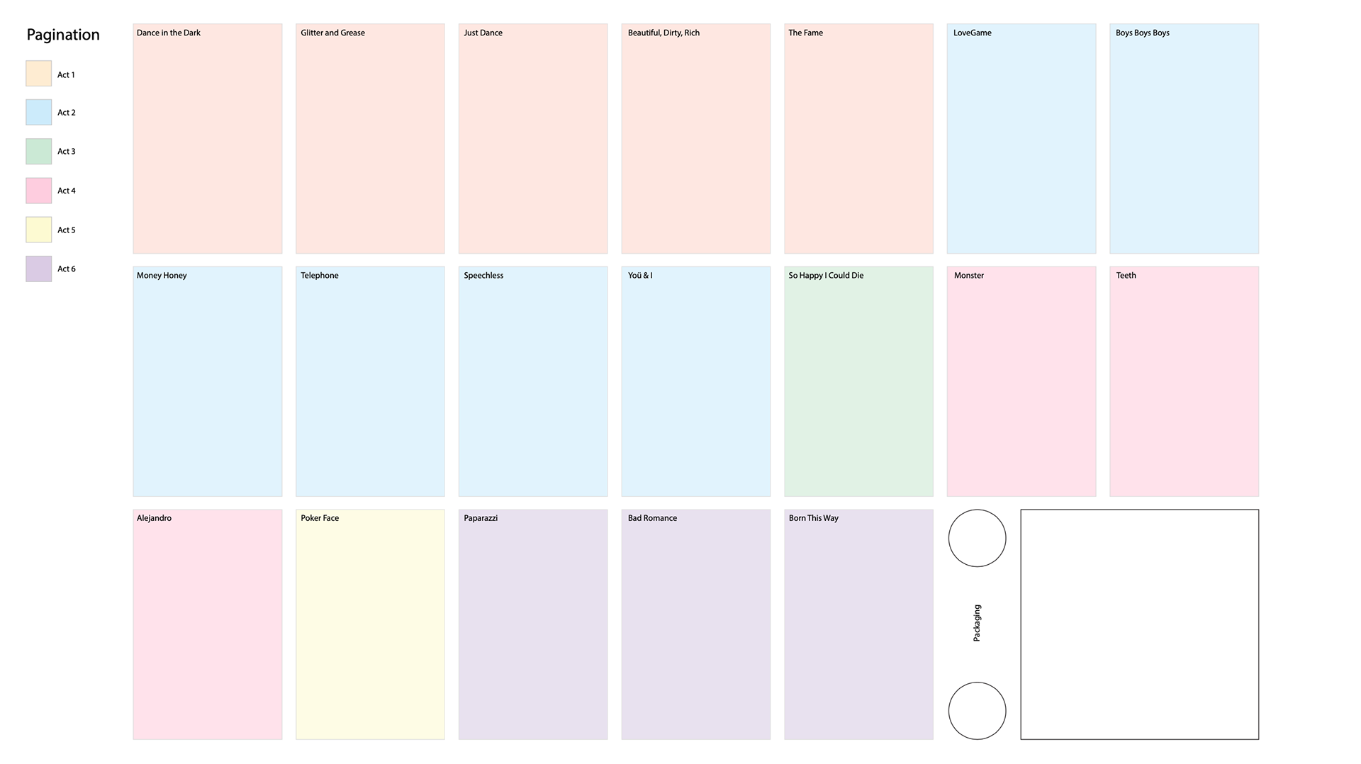
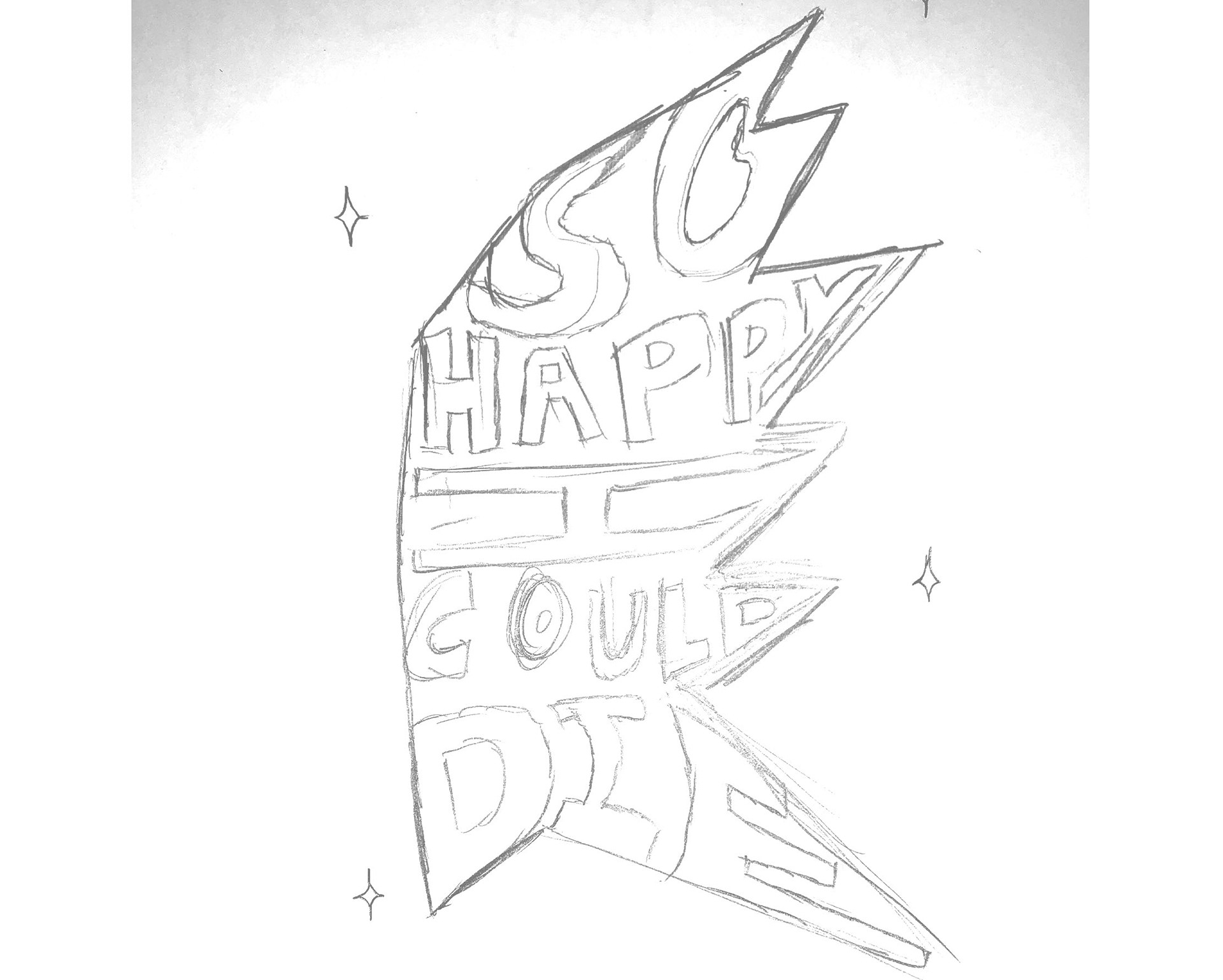
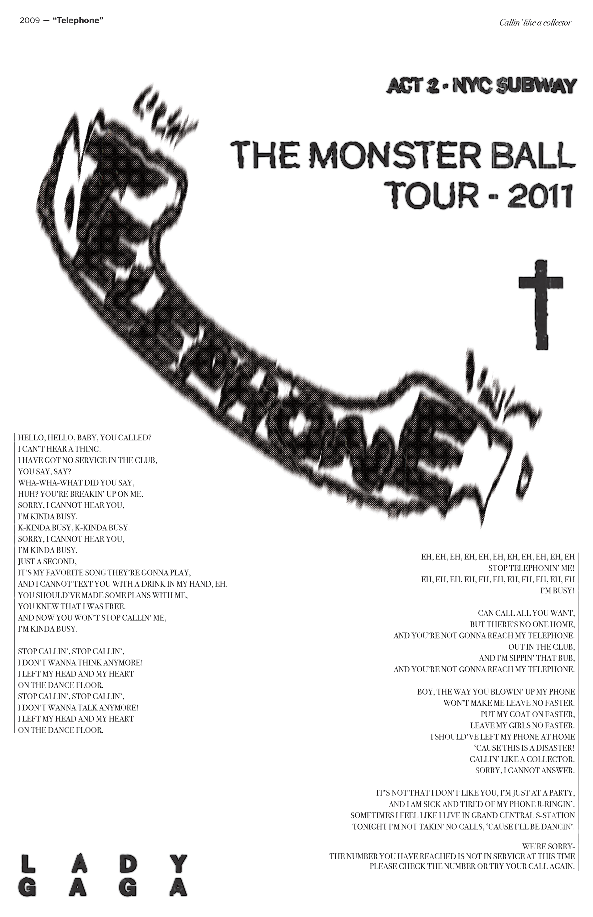
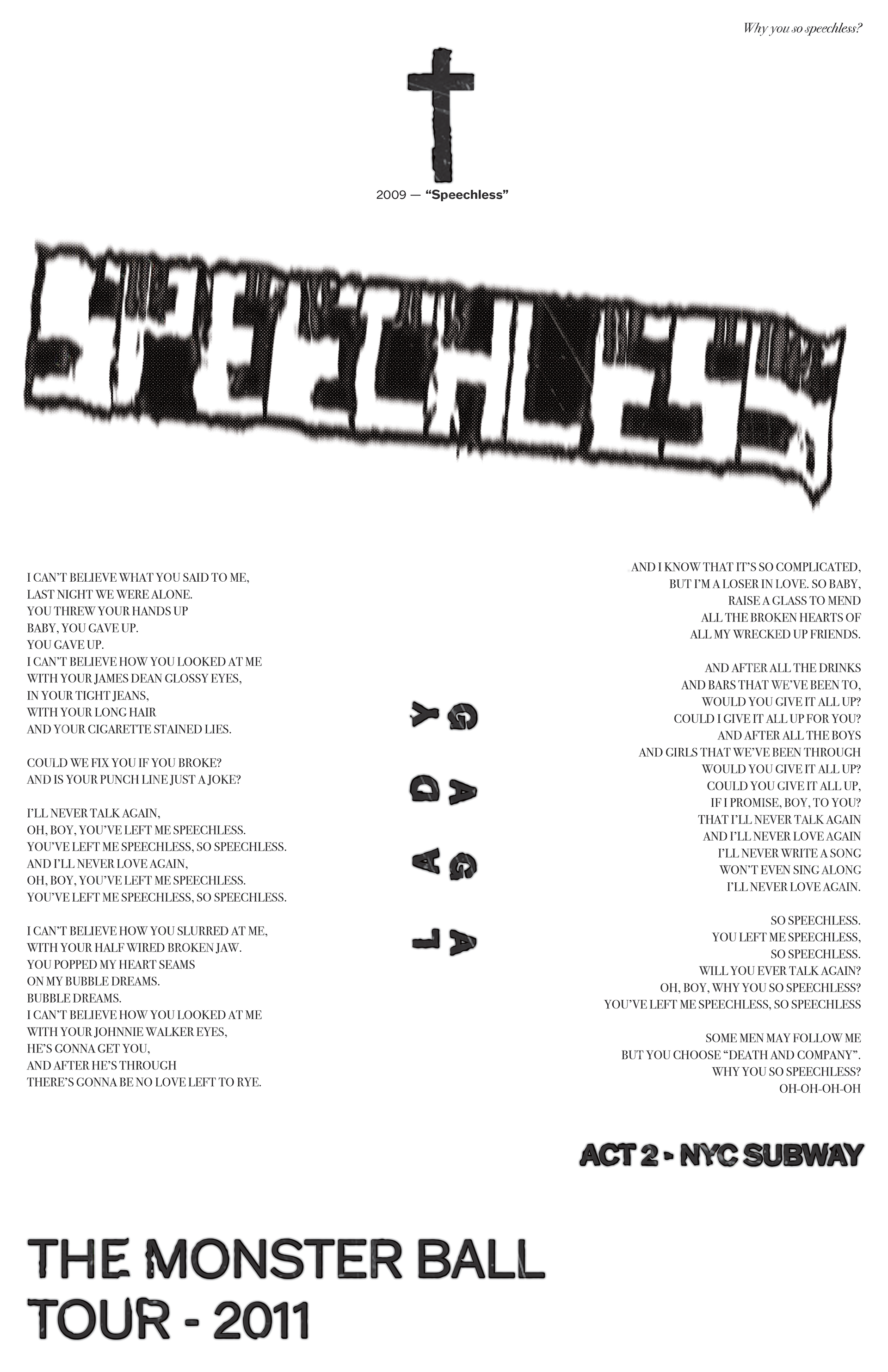
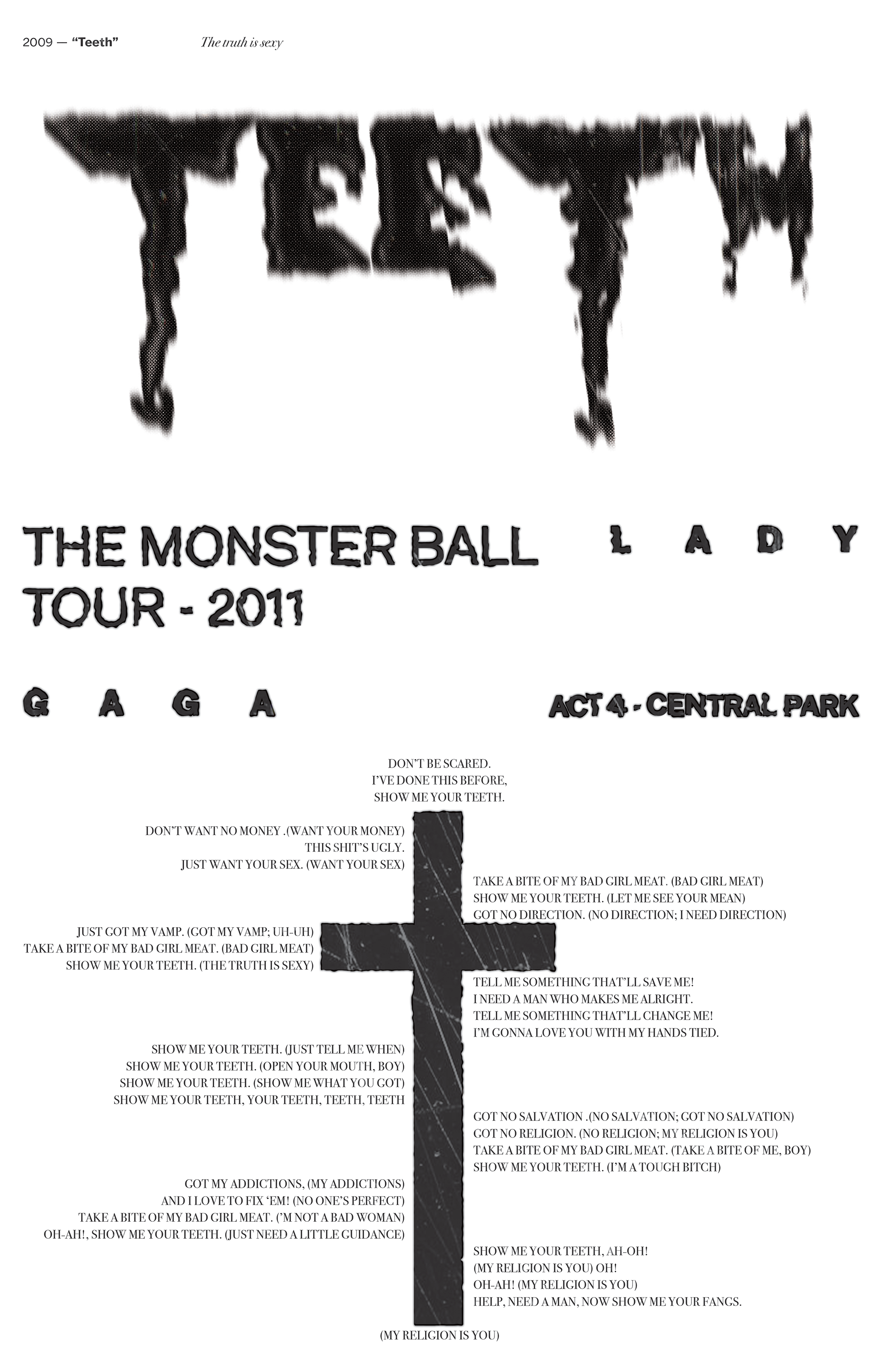
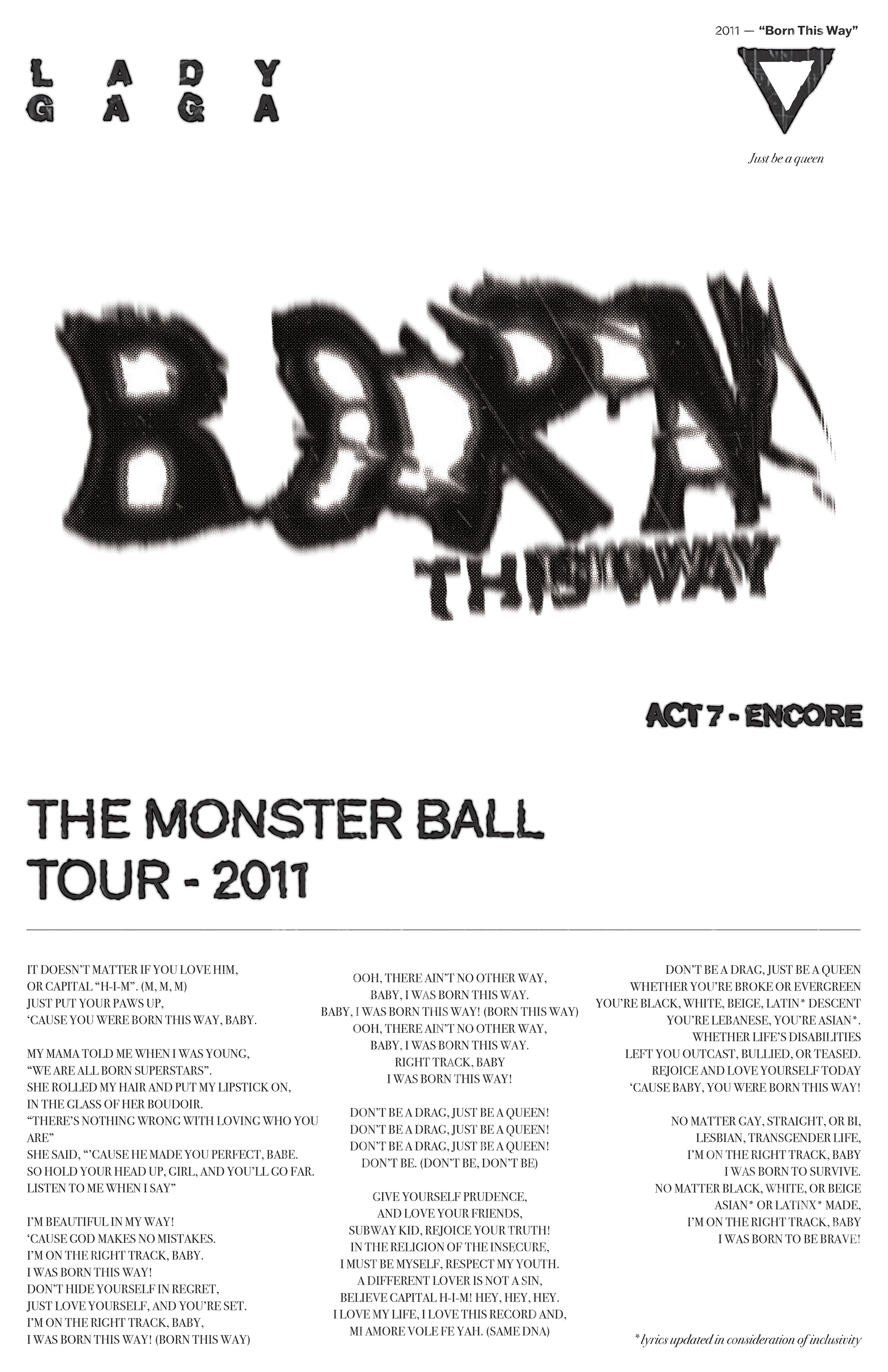
For this project, I wanted to make the ultimate “wheat-paste / street team” fan package featuring 19 posters based around each song from the Monster Ball's setlist. All designs were hand drawn, scanned, and then distorted with the intention to transport fans back to the Sold Out Madison Square Garden when displaying something from this commemorative package.


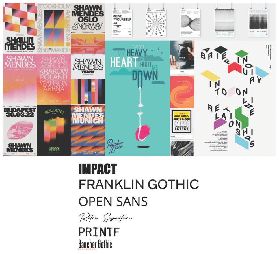
I’ve been inspired by various artists utilize a similar approach when they have gone on tour by designing a unique poster for each city they stop in (Shawn Mendes however, is most notoriously known for this), or making lyric posters for select tracks on an album (The 1975). Referencing these projects in my mood board, I wanted to take a new spin on this tried, but truly unique concept. (Click to see images full screen)
Establishing a consistent grid structure to unite all 19 posters was simple, the challenge lied within creating each design to stand out when displayed by itself, but fit in as a collection. The typographic designs were all in reference to what was happening when the song was performed.
I called back upon the structure of the setlist and pulled inspiration from the set design of the tour to structure my type in similar formations to what might be going on, on stage during the height of each song's special moment when being performed.
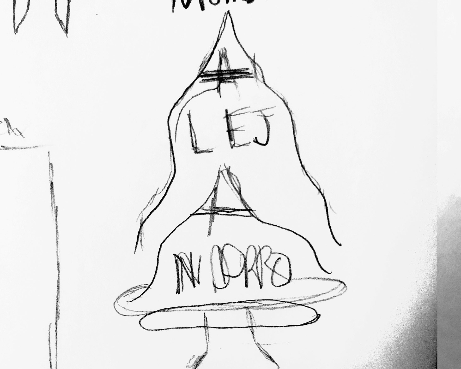
I called back upon the structure of the setlist and pulled inspiration from the set design of the tour to structure my type in similar formations to what might be going on, on stage during the height of each song's special moment when being performed.


This collection is housed inside a poster tube to simulate the shipping process of posters. The housing also acts as a great storage case for the posters when not on display. As a poster collector myself, I have a ton of these tubes sitting in a corner of my closet, so instantly I wanted to play into the tube having a unique mock-shipping label that acts as the cover of this collection.
The bottom right poster was a test print with a different paper and ink quality to see what the posters would look like with intentional streaks and gaps in the ink application.